Binary options traders often do technical analysis with charts to find patterns in the movement of the price of assets. These analyses can improve their odds of making a profit in the long run. Before you can do this you first must understand what the charts are telling you about the market, both in real-time after the market closes. One of the most popular chart type used in the market is the Japanese candlestick chart. These little candlesticks can tell you a lot about what is going on in the market in a specific time interval once you understand how to read them.
The chart below is a typical candlestick chart. It includes all the standard information about the market at that time interval, the opening price, the closing price, the highest and lowest price for that time interval and was the asset price trending downward or upward. These charts are sometimes called OHLC charts since they show the opening price, the high price, the low price and closing price for a time interval.This is the beginning steps of technical analysis.
The chart below is a typical candlestick chart. It includes all the standard information about the market at that time interval, the opening price, the closing price, the highest and lowest price for that time interval and was the asset price trending downward or upward. These charts are sometimes called OHLC charts since they show the opening price, the high price, the low price and closing price for a time interval.This is the beginning steps of technical analysis.

A Little History
Technical analysis by using candlesticks were first used by the Japanese in the 1600s to analyze the price of rice without doing any calculations. The first general use of the candle stick method for tracking prices was done by a Japanese rice trader named Homma Munehisa in 1750, in Sakata, Japan. Today this method of analysis is sometimes called "Sakata's Rules" or "Sakata's Methods". Charles Dow is credited for employing the use of the candlestick charting in the U.S. financial market during the early days of the Dow Jones Industrial Market in the 1900s.
The Anatomy of the Candlestick
As shown in the illustration below, a candlestick is a three component figure with a wick on top of the main body and wick attached below the main body. The body of candle is either green (white in a black & white image) or red (black in a black & white image).
The candle is green when the opening rate is lower than the closing rate and red when the opening rate is higher than the closing rate.
When the candle is green the top of the main body represents the closing rate and the bottom of the body represents the opening rate.
When the candle is red the top of the main body represents the opening rate and the bottom of the body represents the closing rate.
The end of the wicks extending from the top and bottom of the main body is the highest and lowest rate for that time interval.
The chart below is a candlestick chart where each candle represents the price movement for 15-minute intervals. You can change the time interval for your chart to your preference. For instance, if you change this to a one-minute interval then each candle would represent the price movement for a one-minute interval.
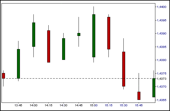 |
| A 15-minute interval candlestick chart |

No comments:
Post a Comment