The movements indicated by each candlestick are movements in short intervals of time and these movements fall in the category of primary movements in the market.
There is another category of movement called secondary movements in the market. For instance, if you observe the day to day movement of the market price for any give asset for a year you will notice an oscillating pattern in the movement. Candlestick charting does a very good job of showing these oscillations on almost any interval of time. That is what makes candlestick charting such a powerful tool for predicting the movement of the price of the assets in the market.
Over the years traders have observed some of these oscillating patterns to develop dozens of strategies to maximize their profits. Here are some of the basic patterns to look for during trading.
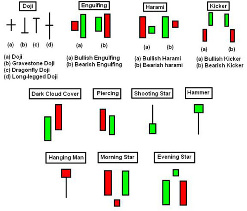
As you can see, there is a lot to learn about trading in the market, but with time and practice these patterns will familiar to you. Once you develop an understanding of the predictive nature of these patterns you will be able to use them to your advantage in binary options trading and put the odds in your favor. I will go in more depth in these patterns and others in future postings.

No comments:
Post a Comment